Research-Magazine Analysis
- Jan 20, 2025
- 4 min read
Updated: Feb 18, 2025
In this post, I will analyse 2 different magazines (Super Street September 2019 & Super Street February 2020), and with the help of my previous research into conventions, I will most likely find it easier to analyse them.
I chose these two magazine because they are the closest to what i have in mind of creating magazine and they will help me very much on making my own car magazine.
Magazine 1 - Super Street September 2019
This is the first magazine that cahtched my eyes because it had all the cars that i liked and they chose only 1of1 special built cars for the magazine and wrote specifications of the cars on each page.
i will put a link of the magazine and attach the cover of it in here. https://www.motortrend.com/magazines/super-street/issue/431645/

The Cover
When describing the cover of the magazine it is clear that they made it as neutral as possible i like the fact that they put a 1of1 built supercar on the cover and put a phrase that stands to the car its like you already began to read the magazine like on the content pages even if its only the cover. The Font that they used on the cover is also on the more basic side. However i dont like the fact that they made the strap line on the cover so small its barely noticable. The Masthead is very noticeable given its size and font, the black color makes it so that its the first thing noticeable on the Cover. In terms of conventions, this cover tends to challenge them. It does have a masthead, a heading, however compared to the average car magazine, this cover is much more minimalist.
Table of Content page
The Content Page respects most of the conventions like the categories & headings, images and so on..
They filled the content page with 3 pictures and made the column line pretty small next to the pictures but it still looks good. Overall the information is clearly lablled, allowing the reader to easily understand what content is where, and its also aesthetic and pleasant looking because of the pictures and how they where put. One thing that is noticeable on this magazine is that It has alot of advertisements for car parts and extras.
Magazine 2 - Super Street February 2020
This Magazine also catched my eye because its exactly like the first one but its focused on the Jdm type of cars that are also tuned and specially built 1of1 cars.
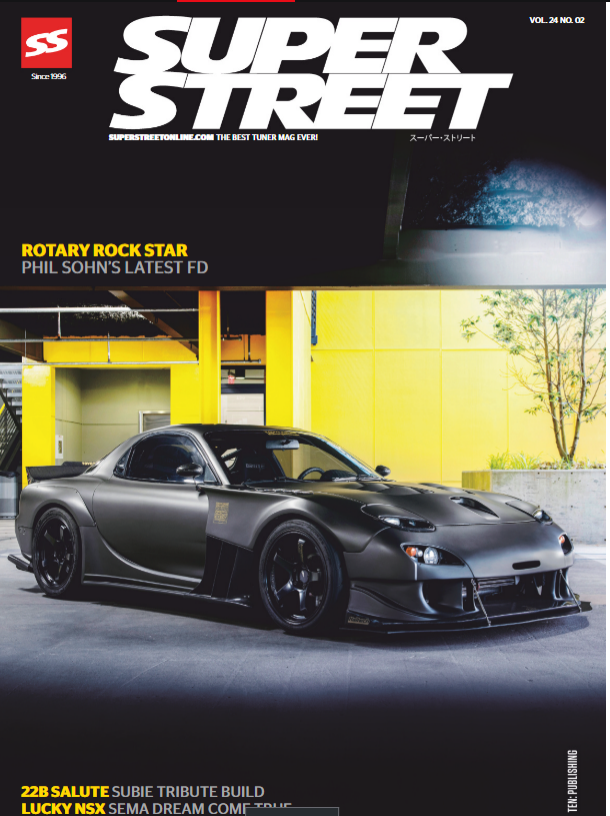
The Cover
On this second Magazine the cover is a bit different it isnt as basic anymore but they filled the Cover with a picture of a specially built and very popular Mazda Rx7. On this cover they didnt use anything special no pull grove or details of the car like in the first Magazine. And this magazine compared to others this cover is more on the neutral side because they didnt fill the cover with phrases or words just the car and a short description from whom the car is.
Table of Content Page
The Layout on the Page is also pretty basic like the cover page a picture of a car that fills the whole page and the Column with the headings and categories is on the top left on top of the car. The weird thing is that the pages of the Headings are randomly sorted under each categorie and will be harder to find. And below the picture there is information about Copyrights and what volume the magazine is.
Content Pages
The Content pages respect all the convetions i used on my other post about Magazine convetions.
On every page they use the Main Image, Pull Quote, Title and Headline. Sometimes they use multiple Pages for the same car to explain the car in more detail and they use specific pictures about what they are explaining of the car.
Magazine 3 - Automobile December 2018
I chose this Magazine because it's much more different than the other two magazines above it doesnt just explain about each car that has been tuned and rebuilt by people it also shows older special cars and explain them in details and what this new modern era thinks about the cars and it also shows details of the cars and explain each part of the car and what its use is.

The Cover
I like the fact that the Cover on this Magazine has a whole different aspect than the last two Magazines its much more eye catching and has alot more text on it. The Masthead on the Cover also stands out the font is much more elegant and is more on the minimalist side but its still a good accent on the Cover. In terms of conventions it does follow some of them, such as the masthead mentioned above. Also, the headline, in this case placed on the higher part of the page, which goes more into detail for the picture on the Cover "Behind the wheel of McLaren's outrageous Senna"
Along with these conventions, it's worth mentioning that the main/cover image is the thing that stands out the most on the cover of a magazine. The Featured car on the cover is The McLaren Senna a track-focused hypercar named after legendary F1 driver Ayrton Senna that has sadly passed away during an f1 race.
Table of Content Page
The layout on the Table of Content pages is much more different than the usual magazines that are using the column layout its much more chaotic. It is spread on the whole page and is also not in order but i still like it because they put on all of the headings explanations on what the topic is about and on some heading pictures too. All the headings are also done in different sizes and they varie from each other. But except from that its chaotic and not in order i still find it easy to find the pages that you are looking for and you also get some info before you are reading the pages. The Table of content Pages are going from page 4-7 and on each double page there is on the right side page (page 5 and 7) An advertisement.


Comments